
Many direct-to-garment (DTG) print defects blamed on ink density or fabric quality are actually digital pre-press mistakes hidden inside an otherwise clean-looking PNG file. An illustration with soft feathered glows, semi-transparent drop shadows, or solid black fills placed over a black T-shirt looks seamless on an RGB monitor—yet produces muddy grey fringes or an unnecessarily heavy ink patch once a DTG RIP converts those pixels into white underbase and CMYK droplets.
For existing apparel print shops running commercial DTG lines, teaching designers and prepress staff how water-based textile pigment interacts with transparent pixels and dark fabric turns heavy, dull prints into crisp, breathable retail garments.
Why Semi-Transparent Edges Create Muddy Haloes on Dark Cotton
On a white sheet of paper, a 20% opacity blue glow fades gracefully into the white background. On a dark cotton T-shirt printed via DTG, every pixel with non-zero opacity signals the RIP software to fire a corresponding amount of white underbase ink beneath the colour pass so the colour remains visible against the dark dye.
When opacity drops below roughly 30%–40% in a soft outer glow or feathered shadow, the RIP lays down a sparse, thin mist of white ink mixed with faint colour. Instead of looking like a clean transparent fade, that low-density white-plus-colour mix often cures as a chalky, greyish halo—or washes out faster than the solid core of the design because the thin pigment layer has less binder mass anchoring it to the cotton fibres.
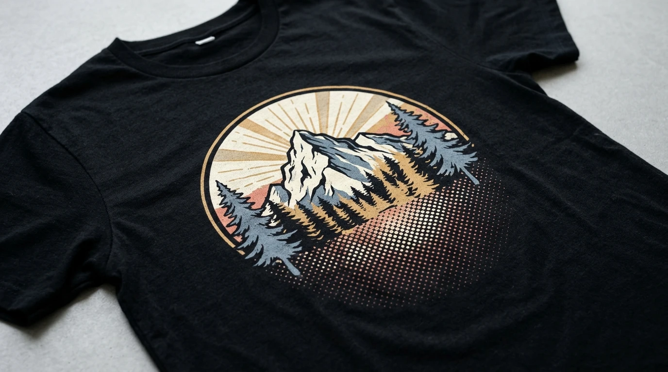
To eliminate soft-edge haloes before the file ever reaches the printer, prepress operators convert feathered fades into halftones (discrete dots of 100% solid opacity that vary in size or spacing to simulate a smooth gradient). Because every halftone dot prints at full ink density with clean white backing where needed, the fade looks smooth to the eye while remaining crisp and durable through laundering.
Using Black-Fabric Knockouts to Improve Breathability and Cut Ink Usage
One of the most effective DTG-specific file techniques is knocking out black artwork areas when printing onto a black 100% cotton garment.
If a designer leaves solid black shadows and outlines inside a graphic destined for a black shirt, an unadjusted RIP may lay down a full white underbase and then print black ink on top of that white layer. That wastes both white and black pigment, slows pass speed, and leaves a noticeably thicker, stiffer square across the wearer's chest.
By knocking out pure black areas in the artwork (making them 100% transparent so the natural black cotton shows through as the shadows of the illustration), the shop achieves three immediate gains:
File Preparation Choice | Effect on Dark Cotton Hand-Feel | Effect on Ink Consumption & Clarity |
|---|---|---|
Printing solid black ink over white underbase | Heavy, warm, rubbery feel across large dark areas | High white + black ink consumption; risks subtle sheen mismatch against the cotton |
Knocking out black to use the garment colour | Soft, breathable, flexible feel where fabric shows through | Lower ink cost per shirt; shadows blend naturally into the garment weave |
Replacing soft alpha fades with solid halftones | Eliminates crusty low-density edges | Crisp gradient transitions without chalky white-ink haloes |
Note that black knockouts work best on true black or near-black garments; on heather grey, navy, or vintage-washed charcoal blanks, knocking out black will let the lighter garment shade show through instead of true black, so operators should preview the artwork against the exact blank colour first.
Resolution, Colour Space, and Line-Weight Discipline
Because DTG prints directly onto knitted cotton loops rather than smooth coated paper, extreme microscopic detail behaves differently on fabric. Saving raster artwork at 300 DPI at actual print size (rather than upscaling a small web graphic) prevents jagged pixel edges, while keeping artwork in a clean sRGB working space allows the DTG RIP's internal ICC profile to map colours predictably to its CMYK + white ink set.
Avoid hairline strokes thinner than the yarn pitch of the garment—especially on dark shirts where a white underbase must sit cleanly underneath the coloured line without peeking out past the edge. Remember also that light-coloured garments are not automatically exempt from pre-treatment in every DTG workflow; check whether the specific ink system requires pre-treatment on white or pastel blanks to hold fine detail through washing.
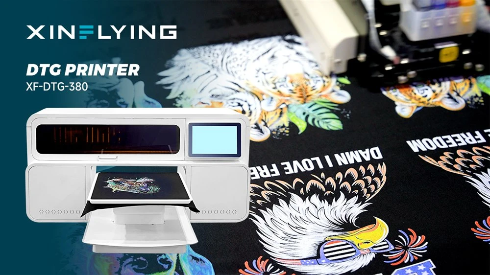
Apparel print shops upgrading their digital garment line to handle detailed illustrations, halftones, and multi-colour cotton runs reliably can explore XINFLYING direct-to-garment printers to compare printhead resolutions and RIP workflow support.
Before sending a new designer's artwork straight into production, inspect the alpha channel against a high-contrast background in your image editor. Catching stray semi-transparent pixels and knocking out unnecessary black fills takes two minutes at the desk and transforms both the hand-feel and the ink economics of every shirt that comes off the platen.


